Introduction
Lenovo's legendary "K" series hardly needs an introduction. If you are looking for good value budget offers in the ranks of the famous Chinese manufacturer, then this is where you will inevitably end up.
With a $200, or so, starting price, the K6 Note definitely has the budget aspect covered. However, serious contenders from the likes of Meizu, Xiaomi and even Samsung at times are constantly battling it out in the $200, or so niche.
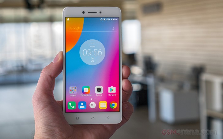
Competing means performing a constant balancing act between price, hardware, user needs and preferences. We often praise good value devices, like the OnePlus 3 or ZTE Axon 7 for ticking all the right boxes at $400, or so, entry point.
When you have only half that budget, it is clear that some compromises have to be made when you have only half that budget to work with. That being said, there are a lot of polarizing new aspects in the latest iteration in the long-running "K" family. Some, you might find appealing, then again, others might put you off entirely. But it is undeniable that Lenovo has been working hard on the K formula, constantly mixing it up generation to generation.
Lenovo K6 Note Key features
- 5.5" IPS LCD display of 1,080 x 1,920px resolution; 401ppi
- Body measuring 151 x 76 x 8.4mm and weighing in at 169g
- Qualcomm Snapdragon 430 chipset; octa-core 1.4 GHz Cortex-A53; Adreno 505 GPU; 3GB or 4GB of RAM;
- 32GB of built-in memory; hybrid microSD card slot (up to 256GB)
- Android 6.0.1 Marshmallow
- 16MP main camera with PDAF autofocus; dual-tone LED flash
- 1080p video capture @ 30fps video capture
- 8MP front-facing camera
- Rear-mounted fingerprint reader
- Dual-SIM model available; Cat. 4 LTE support; 802.11 a/g/b/n, dual band Wi-Fi 802.11n; Bluetooth 4.2, A2DP, LE; GPS; FM Radio
- 4,000mAh battery;
Main shortcomings
- No added front glass protection is officially noted
- Only one bottom-mounted speaker, despite Dolby Atmos enhancement
- No Quick Charge support, even though the chipset should support it
- Hybrid DualSIM/microSD slot limits options
- No NFC or 5GHz Wi-Fi connectivity
There isn't really any one aspect of the K6 Note that helps it shine amidst the competition. The design is rather mundane, although quite stylish and clean, with a few modern touches here and there. The display has no ambitious aspect to boast, like AMOLED technology, nor does the 16MP main camera. The same goes for the internals - no 14nm efficient chipset in sight and only the bigger than average battery capacity of 4,000mAh really stands out.
Lenovo is trying to market the K6 Note for its enhanced multimedia capabilities, including an interesting take on Google Cardboard-style VR, with Lenovo's ANT VR viewer. In the words of Sudhin Mathur, Executive Director, Lenovo Mobile Business Group, India at the device's local launch:
We will definitely look into those claims, but without any particular hardware to back the software features, they mostly come off as marketing talk.
So, it is clear that the Lenovo K6 Note is no showboat in any apparent shape or form. However, it's still a well-rounded budget device.
Join us in the following sections, as we explore how the Lenovo "K" formula has been changed, where the K6 Note shines and where it falls short and most-importantly, as we try to answer whether it can hold a candle to the ever-growing competitors.
Hardware
Lenovo's "K" series has a nice physical progression to boast through the generations. As already mentioned, some hardware segments tend to appear or disappear from model to model, but, at least from a purely dimensional standpoint, the devices have clearly been shrinking over the years. This is all done while maintaining the same 5.5-inch display size.
The Vibe K4 Note, measured 153.6 x 76.5 x 9.2 mm, which the K5 Note slimmed down a bit. Now the newest K6 Note, with its slick unibody, comes in at 151 x 76 x 8.4 mm - a tad slimmer than its predecessor. Moving to the scale, however, we see the K6 Note is noticeably heavier than its older sibling at 169 grams. The good news is that most of this seems to be due to the bigger 4,000 mAh battery. This is by no means an exceptional capacity for this form factor, but is still a nice improvement.
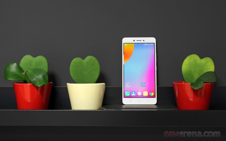
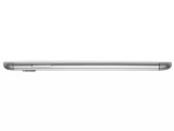
From a purely aesthetic standpoint, the K6 Note ticks a lot of boxes. Its metal finish looks and feels nice. Lenovo could have, perhaps, done a little better in color-matching the top and bottom plastic parts on the back to the metal in the middle. However, that is only noticeable under good light and quite-frankly, it's nitpicking on a budget device.
Truth be told, we can live with the color shades perfectly fine, but the slippery nature of the handset is a whole other story. Lenovo has went for very smooth and rounded lines, which look great, but provide little grip. Perhaps some chamfering would have been a good idea. We often found ourselves struggling to get a proper grip, which is worth noting.
Taking a quick tour around the handset, we see a lot of things have changed in the K-mix, as we mentioned earlier. Some long-time fans might miss this or that, but, overall, there seems to be an upward progression in design.
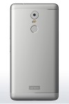
The plastic look, for one, is now long gone, with a second iteration going for metal. It makes up the better part of the back. The remaining top and bottom parts are still plastic and necessary to accommodate a good signal for the various internal radios. The grooves separating the two materials are now wider and a bit rounder and more pronounced than on the K5 Note. This is definitely in tune with the similar detailing used by other manufacturers and it does give the K6 Note a modern look.
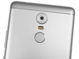
The shiny silver accents in the grooves also nicely match the rings around the camera and the back-facing fingerprint reader.
The fingerprint reader is snappy and very accurate. We had no problem with it and are also happy to report it is always on so touching it can wake the phone from standby.
Our OCD is a bit less happy about the selfie camera and ambient light and proximity sensor on the front of the device. They differ in size, but then again, appear quite evenly spaced, flanking the earpiece on either side. We are happy to report, there is a notification LED on the far right.
The rest of the front is very clean. Just like with the K5 Note. Lenovo hasn't officially mentioned any Gorilla Glass or similar protection for the panel. There is just a slight 2.5D effect at the edges of the glass - nothing fancy, but potentially, just enough to make edge-to-edge tempered glass screen protectors a no-go.
Lenovo has also made sure to include capacitive touch buttons underneath the display, which Lenovo K Note fans have come to expect.
Moving on to the bezels, the left-hand side is mostly empty. It only houses the SIM card tray. In it, you can place two nano SIM cards or exchange one for a microSD. We hope the Moto design, featuring a dedicated SD cradle makes its way to Lenovo's main line as well, as it is an immensely better arrangement.
On the opposing side, you get the standard three-button layout. That includes the volume rocker and power button underneath. These could have been positioned a bit higher and we found them a bit inconvenient, but your mileage may vary, depending on preference and hand size.
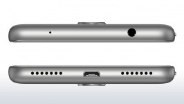
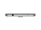
The situation is also pretty standard on the top of the K6 Note. Here you have a 3.5mm audio jack and a little hole for the secondary noise-canceling microphone.
Symmetry is strong on the bottom side as well. Lenovo opted for the older USB 2.0 interface and standard USB Micro-B connector, to go along with it. There are two grills here as well. Only the left actually houses a speaker, while the right is, presumably, responsible for hiding the microphone.
We're not quite sure how the single speaker fits with Lenovo's premise of an enhanced multimedia experience, nor the Dolby tweaks included in the software. But, more on that later.
Display
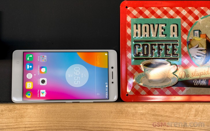
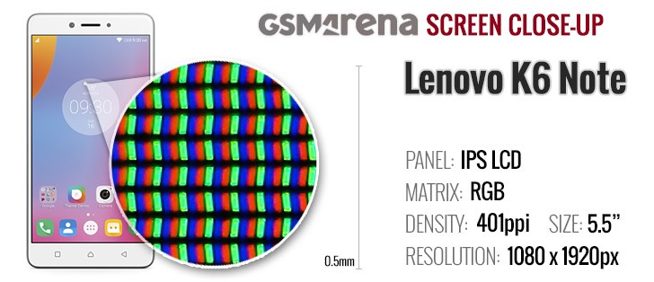
The Lenovo K6 Note doesn't really offer anything special in the display department. The Chinese manufacturer has stuck with a 5.5-inch LCD panel for some time now. It is of the IPS variety and with a resolution of 1080p. That works out to 401 ppi, which is still perfectly sharp.
There are two display modes to choose from for the panel. Neither is really what we would consider truly color accurate, but the Normal preset definitely comes closer. The average DeltaE here is 4.8 - not too bad, with the Orange and Yellow being the most inaccurate at 7.2.
The Vibrant mode offers a little more "pop" and it is what most users are likely to find more appealing. Interestingly enough, Lenovo has decided to enhance both the greens and the blues, but the red is almost unchanged. The DeltaE in this mode is 5.8 on average and goes as high as 10.4 in Magenta.
Contrast levels turned out quite decent for an LCD. With a maximum brightness of 521 nits and almost no noticeable light in the blacks, there is plenty of contrast to go around.
| Display test | 100% brightness | ||
| Black, cd/m2 | White, cd/m2 | ||
| 0.383 | 521 | 1360 | |
| 0.47 | 442 | 940 | |
| 0.24 | 432 | 1793 | |
| 0.42 | 403 | 953 | |
| 0.38 | 439 | 1158 | |
| 0.45 | 489 | 1087 | |
| 0.43 | 518 | 1205 | |
| 0.00 | 408 | ∞ | |
| 0.51 | 628 | 1227 | |
| 0.46 | 424 | 922 | |
| 0.30 | 426 | 1444 | |
| 0.52 | 425 | 816 | |
| 0.34 | 457 | 1344 | |
| 0.32 | 495 | 1560 | |
| 0.33 | 478 | 1448 | |
| 0.45 | 362 | 802 | |
| 0.58 | 416 | 717 | |
| 0.61 | 668 | 1093 | |
| 0.00 | 338 | ∞ | |
While decent, sunlight legibility of the Lenovo K6 Note is nothing to rave about. Plus, the front panel is a bit more reflective than we would have liked and viewing angles could use some improvement as well.
Sunlight contrast ratio
Connectivity
The Lenovo K6 Note is available in a Dual-SIM configuration in certain markets. As already mentioned, the downside is that it uses a hybrid tray, so you have to sacrifice one of the SIM cards to get some extra storage. LTE is also on-board with a speed cap set at Cat.4 or 150 Mbps downstream and 50 Mbps up.
Wi-Fi is fairly basic, but we can't really ask for more on a budget device. There is only 2.4 GHz available and b/g/n standards. On the flip side, however, Bluetooth is a modern 4.2. Sadly, NFC is missing, but, as a consolation, there is an FM radio on board.
The microUSB 2.0 port supports OTG so that you can hook up flash drives and other USB accessories to it. It cannot output video, as there's no MHL or SlimPort functionality.
Battery
As previously mentioned, the Lenovo K6 Note offers a tangible battery upgrade over its predecessors. At least on paper, that is. It packs a 4,000 mAh battery, sealed-in under the non-removable metal back.
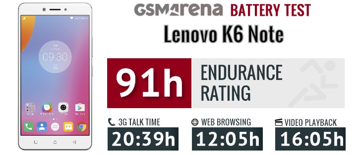
Thanks to that, the Lenovo K6 Note managed a solid 91hours in our proprietary battery endurance test. That is a very respectable result, indeed. The increased battery capacity definitely helps a lot in this respect, but so do various other software optimization, both on Lenovo's end and Android in general.
The lack of any form of quick charging on the Lenovo K6 Note is really frustrating, especially nowadays. What is even more annoying, is the fact that the Snapdragon 430 does officially support Qualcomm's Quick Charge 3.0 technology. Perhaps Lenovo has a valid reason for leaving it out, but the end result is a handset that still requires overnight charging. Our review unit managed to draw a maximum of 2A and an average of around 1.6A from the wall. This left it with 15% of extra charge after 30 minutes and 35%, after an hour.
The battery testing procedure is described in detail in case you're interested in the nitty-gritties. You can also check out our complete battery test table, where you can see how all of the smartphones we've tested will compare under your own typical use.
A feature-rich Marshmallow experience
The Lenovo K6 Note boots an Android 6.0.1 ROM, which comes off as pretty standard and clean out of the box. The second statement is true, at least on some level, as there is hardly any bloatware pre-installed on the handset. This is one of the Motorola influences on the main Lenovo line that we have definitely been enjoying since the acquisition took place.
However, despite its AOSP appearance and snappy operation, looks are definitely deceiving when it comes to this Lenovo ROM, as there are a ton of added extra features under the hood. It really is somewhat impressive, especially since we didn't find a single one that appears to hold back the modest Snapdragon 430 chipset and the overall experience.
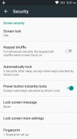
Starting off on the lockscreen, as usual, it looks pretty standard. The fingerprint reader, we mentioned earlier can be put to good use as an unlock method. The print manager is simple and straight-forward and presents you with some options for notification visibility as you go through the initial setup.
However, that is far from the end of the lockscreen experience. If you choose to select a PIN as your backup security measure, there is a nifty little toggle in the settings that can automatically shuffle the numbers on the keypad every time for added security.
There are also other little things sprinkled here and there, like the option to adjust the timeout for automatic screen lock.
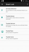
Lenovo has also adopted and enabled Android's default Smart Lock feature, which is not something you see every day. Through it you can set body detection, trusted places, trusted devices and even trusted voices and faces to control the phone's lock status.
Even after a few seemingly conflicting unlock options are enabled simultaneously, they co-exist and work beautifully. You can wake up the phone, have it look for your face and if you happen to not be looking at the selfie camera, it will just, seamlessly go on to wait for a fingerprint, pin or pattern.
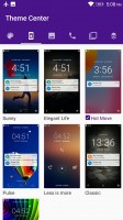
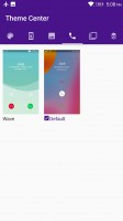
The lockscreen also lends itself to quite a bit of customization. This is done through the Lenovo Theme Center and it is far from the only UI aspect you can tweak. Besides whole complete themes, there are also granular options for the lockscreen, wallpaper and even the base color scheme for certain built-in apps, like the dialer.
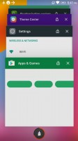
The latter can also be edited in terms of behavior, with two quite different answer and rejection gesture styles available out of the box. The task switcher can also go from the default rolodex style to a horizontal list with a single click. This is all very neat and in fact, the only thing that appears to be missing is an online theme store. There does seem to be a way to sideload themes though.
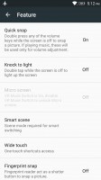
We realize, we still haven't moved past unlocking the device, but, surprisingly, there are a few more options worth mentioning as well. Inside the setting of the Lenovo K6 Note, there is a strangely sounding menu called Feature. It actually houses quite a few powerful additions, which Lenovo has baked into the OS for added ease of use.
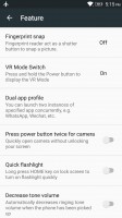
For instance, there is double tap to wake the screen, also a quick still shortcut - just quickly double press any of the volume rockers. And if you would rather quickly unlock to the camera viewfinder, double press the power key instead.
The fingerprint reader can also be used as a shutter control. The phone can even automatically lower its ringer volume when picked up - admittedly a fairly simple thing to achieve programmatically and yet, a hidden blessing when it is simply baked in.
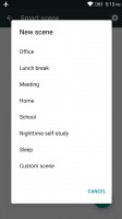
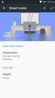
Continuing the trend of easily achievable, but laborious to setup independently features - Lenovo has also thrown something it calls Smart scene in the mix. You can think of it as a sort of automatic profile switcher, like the ones that used to be quite popular in the pre-Android smartphone days and then sort of died off.
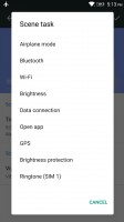
Actually Smart scene is quite a bit more powerful and rather reminiscent of Tasker or IFTTT task automation apps. Scenes can be toggled based on a simple time table, or upon connection to a specific Wi-Fi network or based on a more advanced weekly schedule. The tasks that can be performed automatically include toggling airplane mode, Bluetooth, Wi-Fi, GPS, the data connection and brightness protection. You can also change your ringtone, per SIM card, no less and edit how loud it should be. Perhaps best of all, there is also the option to launch an app, giving developers and tinkerers a lot of power and customizability.
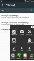
While in the Feature menu, we might as well cover a few other interesting extras the K6 Note has to offer. First, there is the Wide touch feature, which Lenovo Note fans should already be familiar with. It is a floating control overlay, which provides access to the basic navigation controls and some toggles and recently used app shortcuts.
Better still, there are a total of three gestures the floating interface understands, which you can map to your liking.
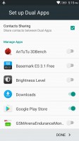
As a proverbial icing on the cake, Lenovo also offers a dual app feature in its OS. It is pretty self-explanatory - enable it, add the apps you desire and then you can have two separate instances of them running concurrently. This is great for multiple social accounts.
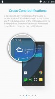
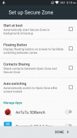
Taking things to the extreme, there is also what Lenovo calls Secure Zone. The feature aims to provide you with a separate and secure second working environment, which is cut-off from the main one. This includes a separate launcher (although there is an interesting hybrid mode to experiment with, as well), separate app instances and files. It all works surprisingly well, especially considering the processing limitations of the K6 Note's hardware.
There are still the VR toggle, Dolby Atmos and Theater mode to discuss here, but we will leave those for the multimedia section. Moving on to the actual launcher (we know, it took forever), it is very clean and neat. Deceptively empty, as was already made clear, it is almost like the Google launcher, minus the Now pane on the left.
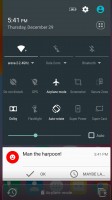
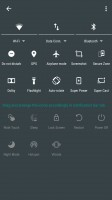
Notifications and quick toggles appear pretty standard as well. Just pull down once or twice, respectively to see them. Both, however, have a little extra to offer behind the scenes.
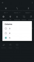
The toggles can be freely modified and rearranged, including changing the number of columns they appear in - also a rare feature.
As for notifications, there is a centralized notification log that keeps detailed tabs on all the things you swiped away. That means you can be as careless as you wish while clearing the shade away as you can always check back on every notification.
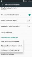
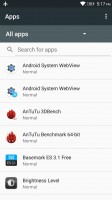
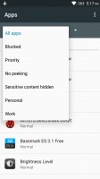
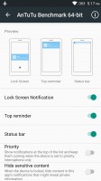
You also get granular control over the notifications. There is a whole sub-menu devoted to that alone. You get powerful per-app and notification type control. There are also toggles for per-app priority and for hiding sensitive content from the notifications.
Per-app notification control
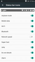
The menu keeps on giving with little things, such as the ability to hide or show notifications about captured screenshots or Bluetooth and Wi-Fi connection status changes. You can even edit the contents of the status bar and decide which icons to show and which to hide, just like you would on a Windows PC.
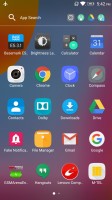
Last, but not least, there is the app locker. It is a rather standard side-scrolling affair. Still, you do get a couple of neat added features here as well, housed in the top bar. On the left, there is a convenient search bar and directly next to it, the OS automatically maintains a list of shortcuts to your most recently used apps in order.
























No comments:
Post a Comment